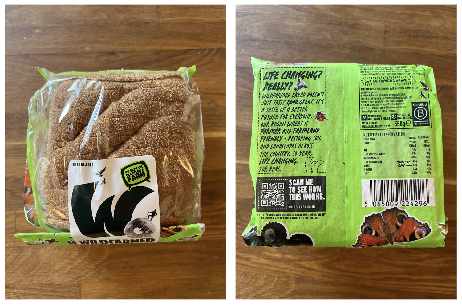
The final bread packaging design
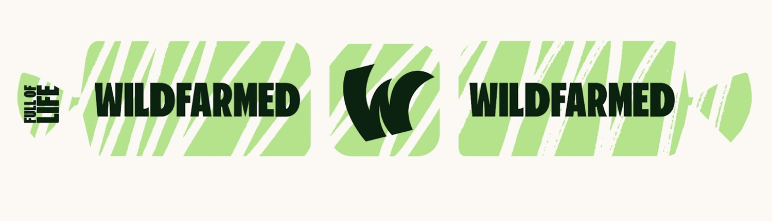
WILDFARMED – CREATING A LIFE CHANGING BRAND.
“Chaos is a ladder.” Brandon Stark
Wildfarmed is a new regenerative farming brand taking the UK by storm. Founded by Andy Cato one half of Groove Armada. We have worked with them since day one but this year saw the first consumer facing products and campaigns for a range of bread launched at Waitrose.
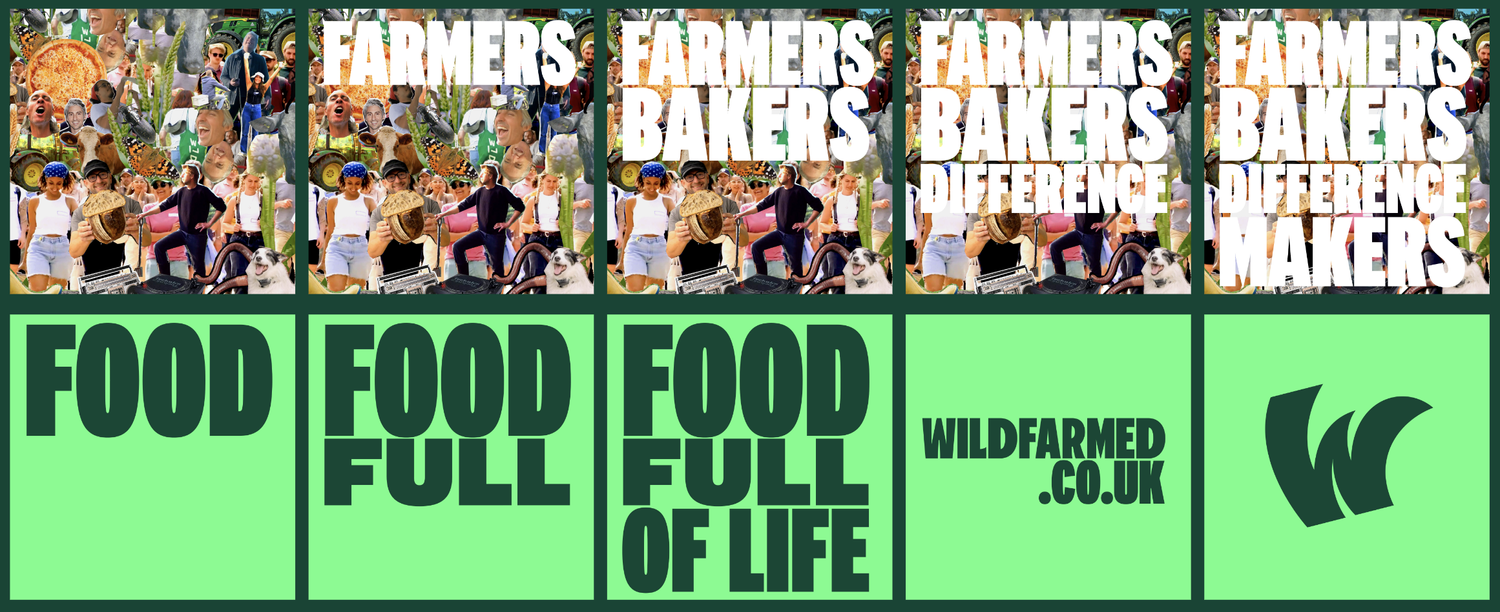
We developed the product strategy: Life Changing Bread. The idea being that regen farming really does change lives and it obviously tastes amazing.
We designed the packaging and all the entire marketing campaign for a huge Waitrose launch. The campaign has been a huge success with the founders being invited on to the country’s hottest TV property : Clarkson’s Farm.
Below is a long list of work - smaller case study coming soon.
PACKAGING IDEAS
Let’s bring the party to the bread aisle.


DE LA SOUL VS THE BEATLES
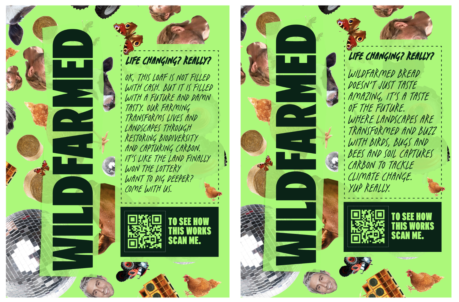
We had two main concepts for the packaging design. Both based on the earlier image cut outs. One we called “Sergeant Pepper” (loads of cutouts of people) and the other “Three Feet High and Rising” (elements cut out with space between them based on the De La album cover)...
Share


THE PACK DESIGN
Is there such a thing as too crazy?
Here are a few of the working designs up to the final packaging designed with the wonders that are Josh and Pete at Localprovisions Studio .
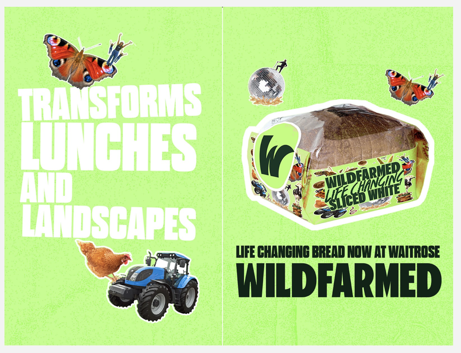
(btw you will notice Andy’s face disappearing throughout the iterations. He didn’t like being on the pack. So we stuck him smaller on a disco ball, maybe he still hasn’t noticed...)
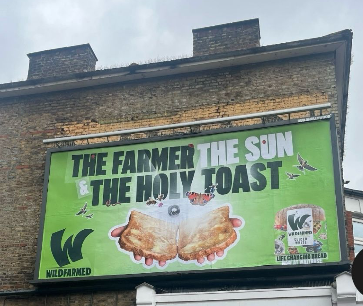
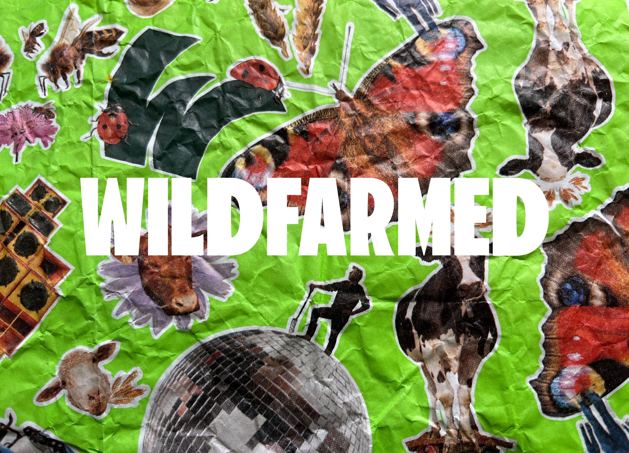
All the items on pack are actual bugs, birds, animals and flowers from Andy’s farm. We compiled an index in case anyone wanted to know. And Waitrose wanted to know...
We added a white outline to all the elements to make them stand out against the green and look like stickers.
Share


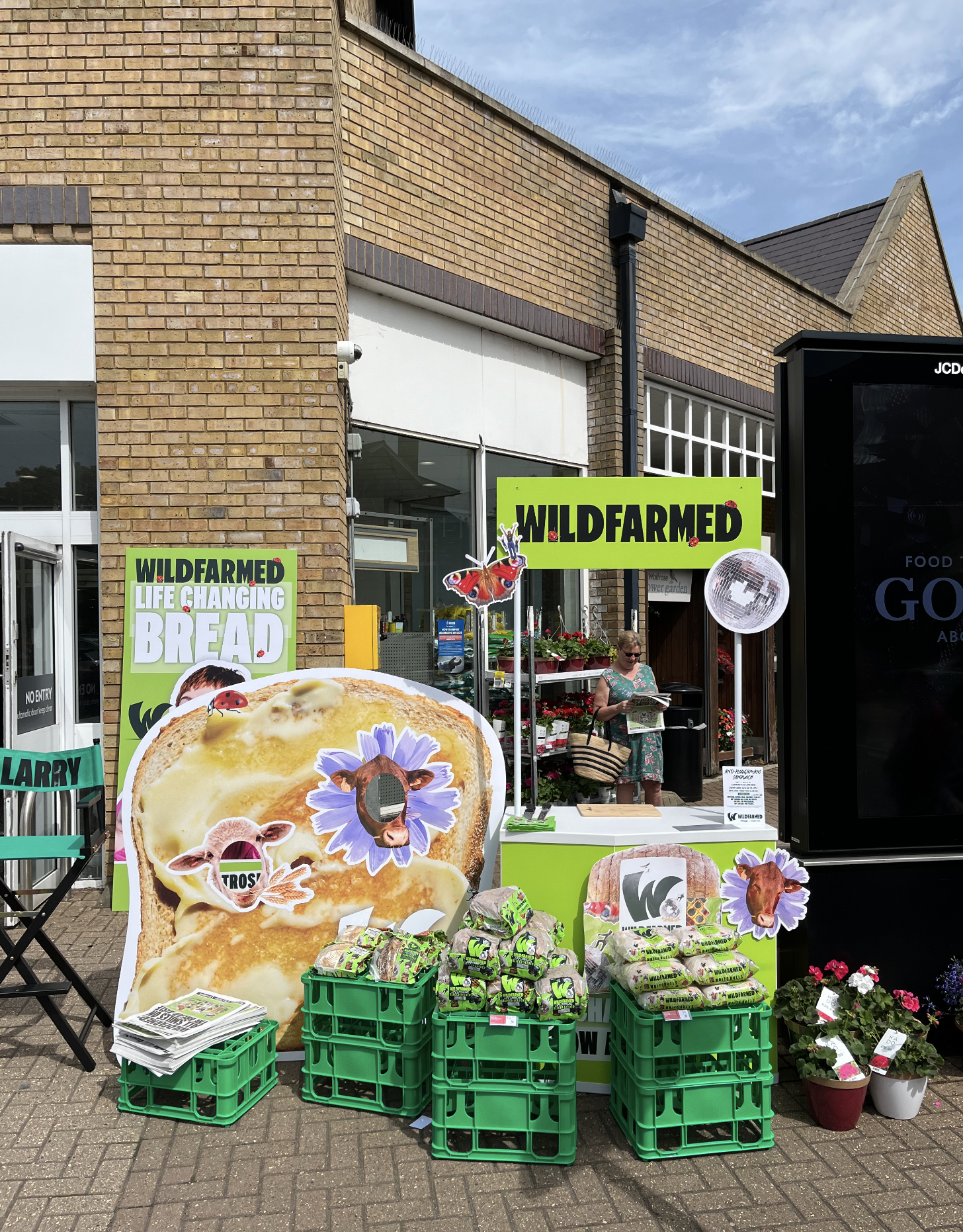
WAITROSE PROMOTION
The Waitrose in-store (in front of store) promotion got real pretty quickly.
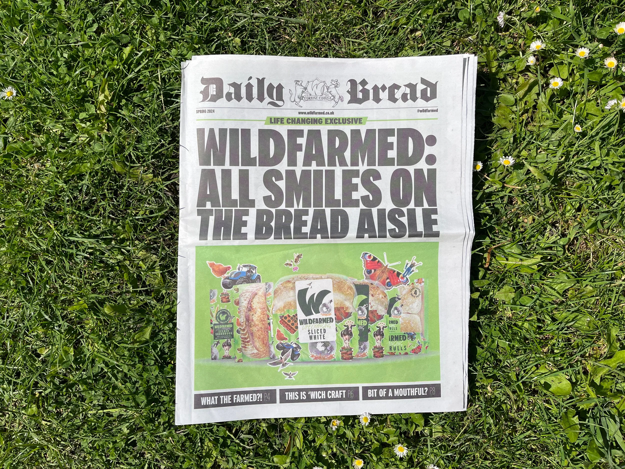
We also created a promotional newspaper that was handed out.


OUT OF HOME ADVERTISING
And then we started look at the OOH application of the brand and what messaging would cut through…
We landed on 4 main ideas, with one killed in the last minute:
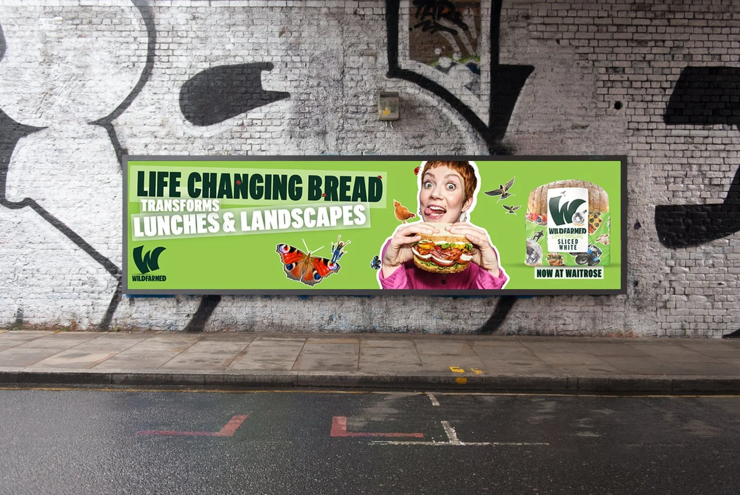
Transforms Lunches And Landscapes
Things Can Only Get Butter
The sun the Farmer and the Holy Toast
Pay More Get Less (Less pesticides etc…)
We shot 4 concepts in a day with two models. Not everything worked, but we got some energetic shots for the OOH
And finally a TV ad.